A sense of perspective on NZ Covid data
(from Jefferies et al. Lancet paper. https://www.thelancet.com/journals/lanpub/article/PIIS2468-2667(20)30225-5/fulltext)
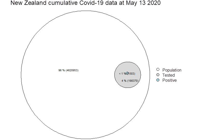
Outer circle here is proportional to NZ population, grey is those tested. Blue is those who tested positive. Hospitalised and ICU cases too small to print.
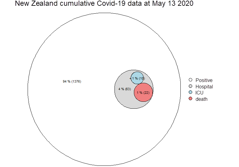
 Zeroing on test positive cases (blue circle above, now below), it is not possible from paper to know how many deaths actually went to ICU, so these cells may not be mutually exclusive…