Iceland gives us a unique insight into Covid-19 infections since it has one of the highest per capita testing rates in the world, over 10 fold greater than New Zealand.
What’s more they are very open about the severity of cases, and the proportion that need hospital treatment and intensive care.
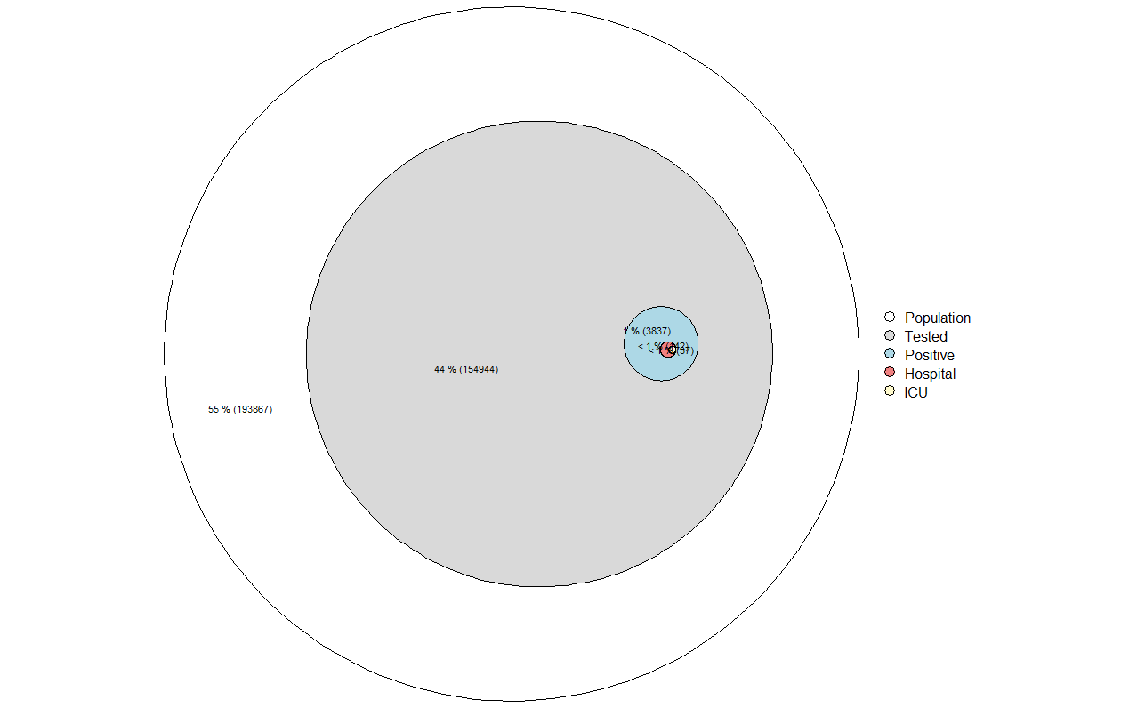
Iceland has also conducted community surveys of their population. This information is not publicly available in New Zealand. While tables of these figures may be useful, it is sometimes difficult to understand the sense of scale from them.
Euler diagrams scale numbers or percentages to an area of a circle or ellipse. Overlapping relationships may also be depicted. The outer circle represents the 356,000 population of the Nordic country, the grey is the roughly 44% of the population who have been tested, the blue indicates the ~4,000 people (2.5% of all tests) who returned positive. The red indicates those who required hospital treatment (~5% of test positives), with the small yellow circle indicating the 1% of test positives who were treated in intensive care.
Deaths (10 at the time of writing – meaning a case fatality ratio of 0.25%) were too small to render on the diagram.
This study, which outlines antibody testing in a sample of 30,576 people in Iceland suggests that half of all PCR + cases were detected. Therefore, the infection fatality ratio is about half of the case-fatality ratio, so about 0.125%.
This diagram illustrates that in Iceland, only ~1/20 positive Covid infections resulted in the need for hospital treatment. With the high rate of per-capita testing, this information gives us a more accurate assessment of the clinical severity of Covid-19 infection than is otherwise available from countries where testing is more directed at only people with cold or flu symptoms. The plot offers a visual sense of the burden of the virus to hospital and intensive care resources.
Iceland data (16/10/20)